
Trading is more about technical analysis, and in technical analysis, candlestick charts are used the most. Buying or selling decisions are made by observing price action created by candlesticks.
Technical Analysis → Price Action → Candlestick Charts
In this article, we will learn what a candlestick is and how it is formed.
Important Terms to Know Before Proceeding:
- Time Frame – A time period such as 24 hours in a go, which is called a daily time frame. It represents the interval between the market’s opening and closing time.
- Price Action – Simply means how the price behaves and moves in a chart.
- Line Chart – Shows only the closing price (such as the last price of the daily time frame).
- Candlestick Chart – Shows four price points of a session: Opening Price, High Price, Low Price, and Closing Price.
What is a Candlestick?
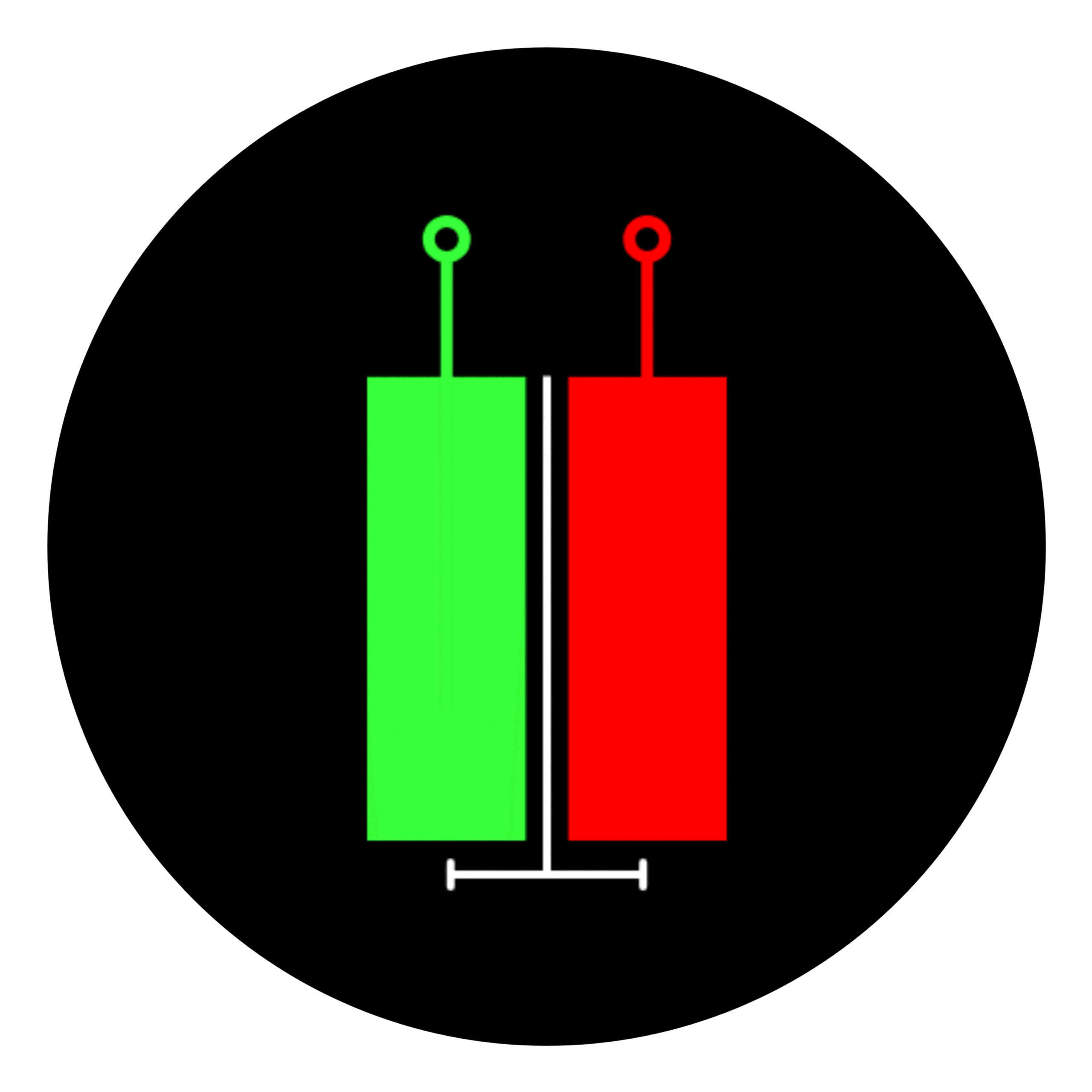
A candlestick is a figure that denotes four types of prices within a given time frame, such as a daily time frame.
It consists of two parts:
- A Body – The main portion of the candlestick that represents the difference between the opening and closing prices.
- A Wick (Shadow) – The thin lines extending from the body, representing the highest and lowest prices of the time frame.
How is a Candlestick Formed?
To understand how a candlestick is formed, let’s consider a daily time frame where the stock market opens at 9:15 AM and closes at 3:30 PM. The market activity throughout the entire day is represented by one candlestick for that day.
Example:
Suppose there is a stock named “Apple”, and its price movements on a particular day (Monday) are as follows:
- Opening Price (at 9:15 AM): ₹100
- Lowest Price (at 11:00 AM): ₹80
- Highest Price (at 1:00 PM): ₹160
- Closing Price (at 3:30 PM): ₹140
How This Reflects on a Candlestick:
- The body of the candlestick will be formed between ₹100 (opening price) and ₹140 (closing price).
- The wick will extend from ₹80 (lowest price) to ₹160 (highest price).
If the closing price is higher than the opening price (₹140 > ₹100), the candlestick is usually colored green (bullish candle), indicating a price increase.
If the closing price is lower than the opening price, the candlestick is usually red (bearish candle), indicating a price drop.
How Are Candlestick Charts Different from Other Chart Types?
Apart from line charts, which only show closing prices, there are other chart types like bar charts and OHLC charts that also display price data. However, candlestick charts are visually more informative. Let’s see how they differ:
- Bar Charts – These use vertical lines to show the high and low prices. The opening price is marked by a small horizontal tick on the left, and the closing price is marked on the right. However, since bar charts do not have a filled body, it is harder to quickly understand whether the price moved up or down.
- OHLC Charts – These are similar to bar charts because they also show the open, high, low, and close prices. However, unlike candlestick charts, they do not use colors to indicate price movement. Candlestick charts use green to indicate price increase (bullish movement) and red to indicate price decrease (bearish movement), making them easier to interpret.
Why Are Candlestick Charts Preferred?
Candlestick charts are preferred because they provide a clear and easy-to-read format.
The colored bodies make it simple to understand price movement at a glance, helping traders make quicker decisions based on price trends.
With over 3 years of experience in financial markets, we focus on simplifying global and Indian markets through clear, practical insights. Our expertise also extends to the evolving landscape of digital finance, including blockchain, stablecoins, and decentralized finance (DeFi).